
Your Dashboard Looks Great and Changes Nothing

Most dashboards get opened once and ignored for every decision that matters. Here’s how to tell if yours is one of them.
This problem is everywhere. Data teams build beautiful visualizations that stakeholders glance at once, nod appreciatively, then ignore for every decision that matters. You see the same confession across analytics forums, Slack channels, and team retrospectives. The analytics industry has mastered the art of building. We’ve failed at measuring whether it changes anything.

Welcome back to The Data Letter! Here are some recent articles you may have missed:
Vanity Metrics vs Decision Velocity
There’s a difference between dashboards that look right and dashboards that change behavior. Most teams optimize for the first. They measure views, shares, and executive compliments. These are vanity metrics dressed up as success signals.
What matters is decision velocity: how quickly can someone move from seeing data to taking action? If your stakeholder opens your dashboard, scrolls through twelve trend lines, then schedules a meeting to ‘discuss next steps,’ you’ve built decoration, not infrastructure.
Back to diagnosing the problem…
Kill This Dashboard Test
Here's how you diagnose it. Ask your stakeholders these questions:
What decision did you make because of this dashboard in the last two weeks?
If they pause or pivot to talking about how useful it ‘could be,’ you’re watching theater.
If I removed this chart tomorrow, what would break?
If nothing breaks, nothing mattered.
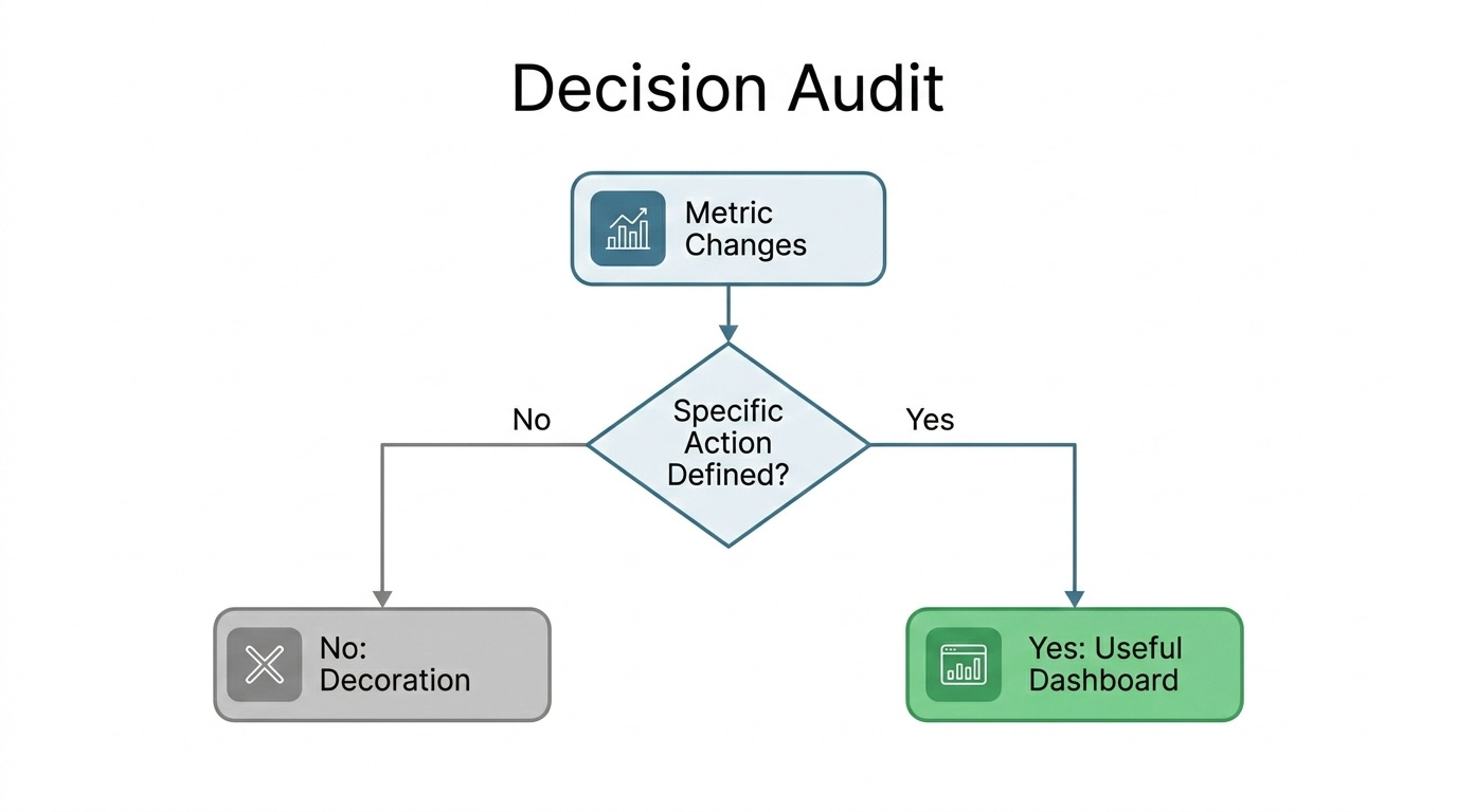
When this metric moves, what do you do differently?
If they can’t name a specific action, the metric is decorative.
Signs you’re building something nobody uses:
Stakeholders request more charts instead of fewer
They want ‘visibility’ but can’t define what changes when they have it
They complement your color palette more than your insight clarity
Building for Impact, Not Applause
Start with the decision, not the data. Before you touch Tableau, ask: ‘What’s the one thing this person needs to do differently?’ Then build backward from that action.
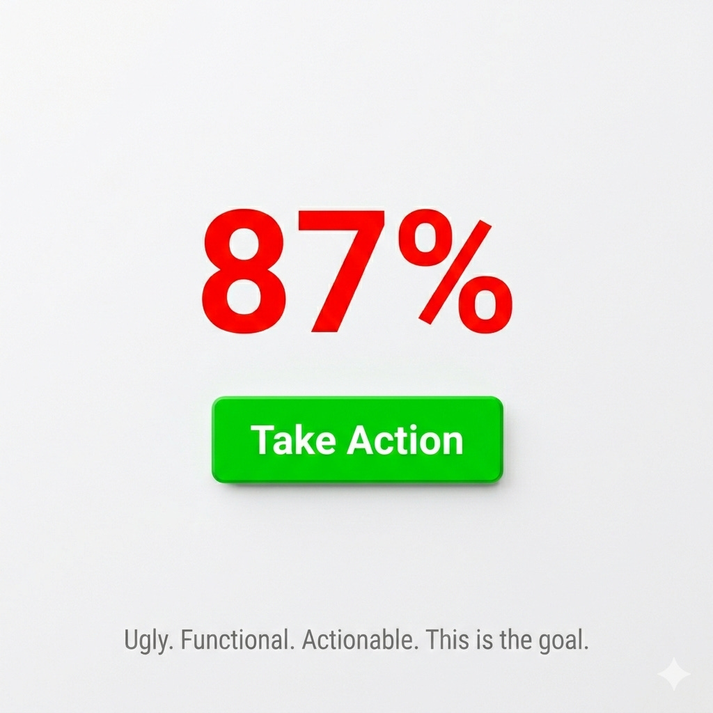
Strip everything else. Your stakeholder doesn’t need context, trends, and breakdowns. They need the number that triggers the action, and they need it unmissable.
Make the action as easy as the view. If someone sees ‘conversion rate dropped 12%’ and then opens Jira to create a ticket, you’ve failed. The button to create that ticket should be right there.
Test by removing features, not adding them. Show version A with ten charts. Show version B with two. Measure which one changes behavior faster.
How to Build Dashboards That Drive Action
Ask yourself whether what you’re building will change anything.
Close the dashboard and watch what happens. If nobody’s behavior shifts, if no tickets get created, if no priorities change, you’ve answered your own question. Strip out everything that doesn’t trigger an action. Give stakeholders fewer charts and clearer next steps. Measure whether anyone does something different after seeing your work, not whether they say they like it.
Next up: a decision-first framework for building dashboards that stakeholders use to take action, complete with templates and a stakeholder questionnaire.